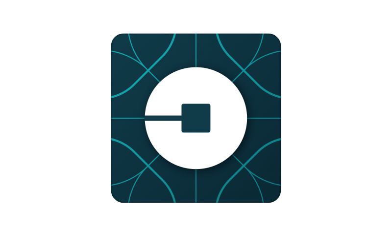
Update your Uber app and you'll notice the icon looks...different. The well-known "U" logo is gone, and it's replaced with something that's harder to describe. It's a shape with a "bit" in the center (as Uber calls it) - and there are separate designs of the logo for the Rider (green) and Driver (red) apps.

The "bit" will be something that now appears through the company's site and app design. As Uber introduces new products, they say you'll always see the bit in the center and know that it's part of Uber. The company has recently been expanding into services like food delivery, so the one bit to rule them all explanation is (mostly) understandable.

In addition to changing the logo, there's a new "substantial" typeface and different color schemes depending on region (gone is the harsh black and white look.) The typeface is most notable when it comes to the "U" where the stylized curls on the top are gone. So the typeface is pretty much a basic sans serif font. Kalanick says the typeface change "will help you see Uber from afar."
The only thing I can't see in the logo is what I need to see "U" for Uber. https://t.co/U2yzlhO7rN
--- Om Malik (@om) February 2, 2016
this is some real liking-the-smell-of-their-own-farts shit from uber right here https://t.co/NRmvM8Dnrx
--- dan seifert (@dcseifert) February 2, 2016
WTF is this new @uber icon?
--- Harry Heymann (@harryh) February 2, 2016
Fav if you expected the new Uber logo to be a fleet of taxis crushed under the boot heel of capitalism
--- Casey Newton (@CaseyNewton) February 2, 2016
The press release that announced the changes, written by CEO Travis Kalanick, is filled with branding hoopla that is easy to giggle at: "The first thing you'll notice is that our logotype is at once more grounded and elevated." Grounded and elevated? Maybe I'm not elevated enough to understand that.
