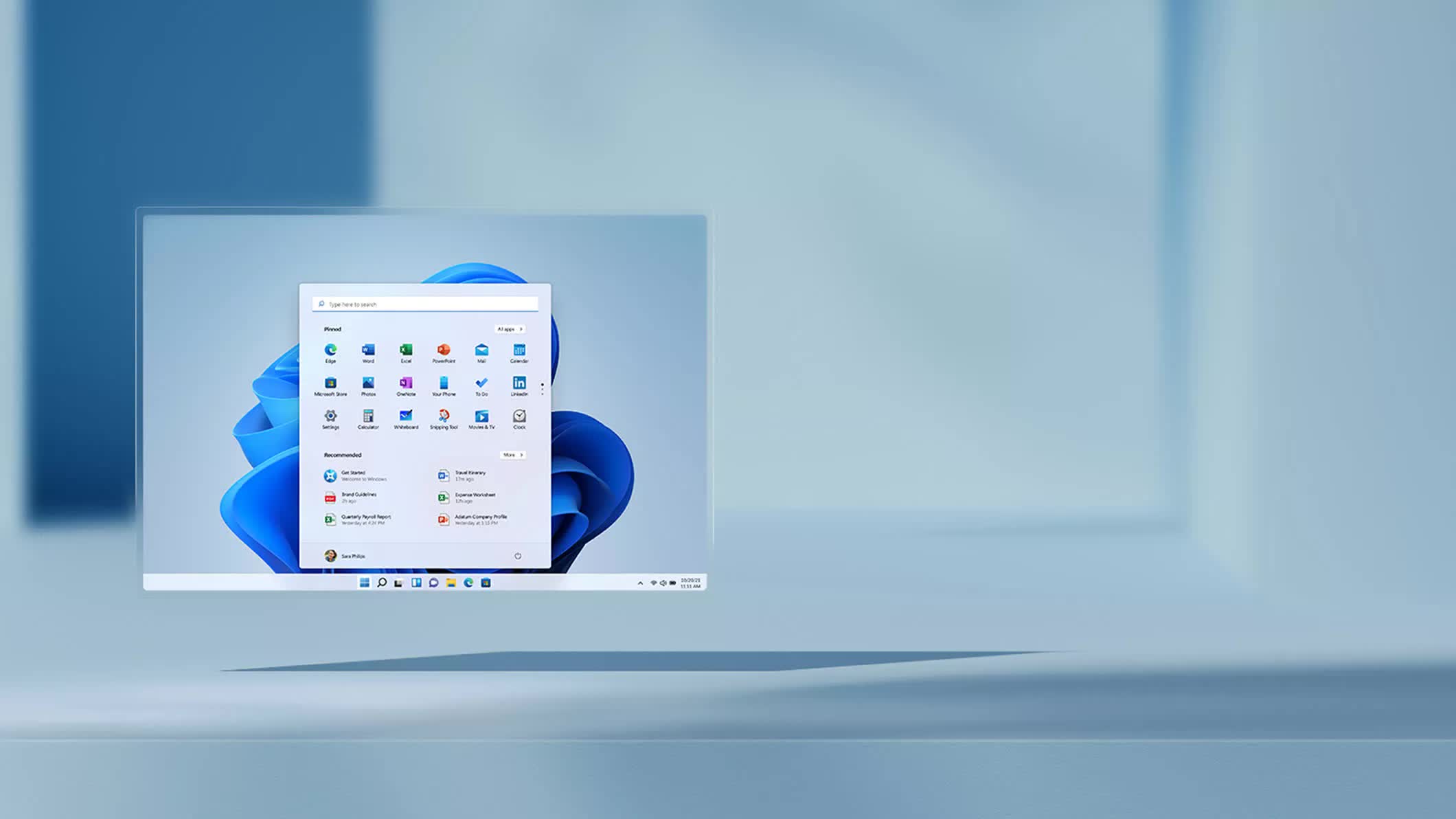
The big picture: If there's one thing Microsoft loves to tinker with, it's the Start menu. After years of experimentation, the company still hasn't settled on a definitive design for Windows 11. Microsoft continues to play around with different layouts and is even testing new "companion" panels in various configurations.
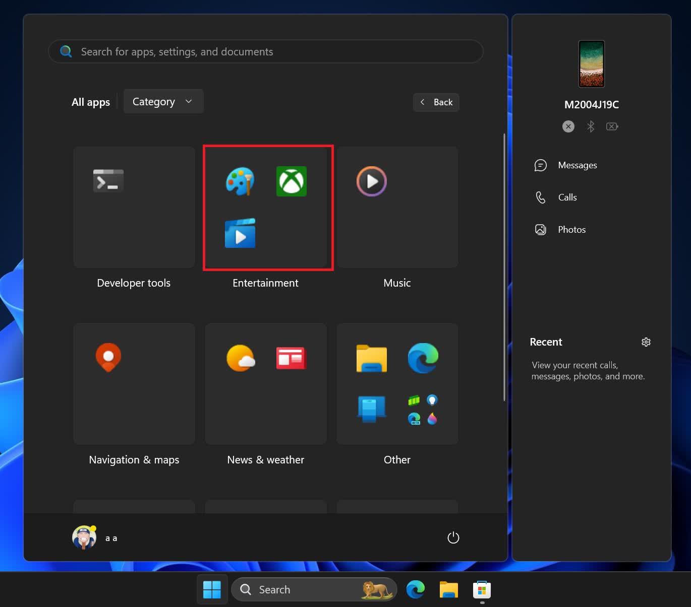
Another potential change involves new layouts for the "All Apps" section of the Start menu, including a categorical view. Instead of listing installed apps alphabetically, Microsoft appears to be testing an iOS/iPadOS-style system that automatically groups apps into categories like Productivity, Photo & Video, Entertainment, and so on.
Windows Latest has provided a glimpse of what this might look like. The shared screenshot shows a grid of rectangular tiles, each representing a different category. Each category displays four apps, with the option to expand and reveal more. Additionally, a new companion widget is seen floating on the right.
A previous build from July only showed the basic structure of these categories, with each displaying colored blocks rather than actual apps. The new build improves on this, though the implementation still appears to be a work in progress. While you can now see actual app icons in the blocks, the subcategory functionality to display more apps doesn't seem to be working properly yet, the publication notes.
Beyond the iOS-like app categories, we previously covered an experimental, more traditional grid-style "All Apps" layout that groups apps alphabetically by the first letter, similar to the app drawer on Android. This grid layout appears to be further along, with Windows Latest describing it as "in a much more functional state" than the categorical view.
These potential new layouts could be a welcome change from the current "All Apps" default, which honestly has too much wasted space. Both the category and grid designs aim to make navigation easier and help users find what they need more quickly. We speculate that both options might make the final cut, with Windows allowing users to choose between them.
Of course, perpetually tweaking the Start menu is par for the course with Windows. Microsoft has been making changes to this core navigation component since Windows 8 introduced the tile-based Start screen design. Windows 11 walked back some of those radical changes, but as this latest experimentation shows, Microsoft might be gearing up for yet another major overhaul of the UI.
Windows 11 Start menu app categories in the style of iOS take shape

