Despite how much people claim to like change, at the core we are creatures of habit. Just as we saw when Facebook introduced Timeline and as we will see when Twitter makes its next significant change, people are going to get up in arms about it. Apple's iOS 7 was no different.
Described as the biggest change to iOS since the introduction of the iPhone, iOS 7 has been available to the general public for roughly two weeks at this point. That's given everyone plenty of time to get accustomed to all of the changes and vent about them, but for us, it's served as an evaluation period.
Looking beyond the flat UI and the animated background, has that much really changed in Apple's mobile OS? What did Cupertino get right with the update and what areas or features are still missing? To help answer these questions, I've put together a list of the top six things that are still missing in iOS 7 as well as the six things that Apple nailed with the update.
The Good
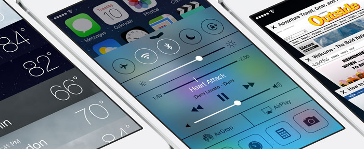
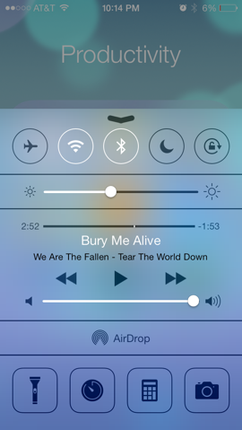
Control Center is one of the best additions to iOS 7 even if it is a shamefaced adoption from Android. The panel provides quick access to toggle features like Bluetooth, Wi-Fi and Airplane Mode as well as sliders to adjust volume and screen brightness. There are even shortcuts to useful apps like Clock, Calculator and Flashlight.
To access Control Center, just swipe up from the bottom of the screen.
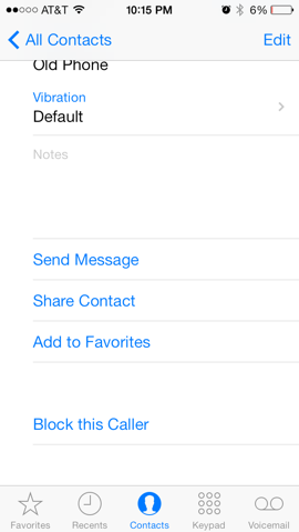
It's about time Apple implemented a way to block unwanted communications. There are two methods to block offending callers in iOS 7. If someone is already in your address book, simply tap on their profile, scroll to the bottom of the list and select Block this Caller. You can also add numbers to the block list by going to Settings > Phone > Blocked.
Blocked contacts will not be able to call, send messages or initiate a FaceTime video chat.
Timestamps in Messages aren't exactly new as iOS 6 offered similar functionality. The problem, however, was that the OS would selectively provide timestamps - like when a new conversation was started or after a long period of silence.
With iOS 7, that's no longer an issue. Simply swipe to the left while in a conversation to see when each message was sent or received. It's convenient that it the timestamps aren't always there to serve as a distraction but can be accessed on-the-fly.
I was unsure whether or not to list this as a positive or negative as people seem to be split pretty evenly across the board. I ultimately see it as a pro simply because A) the old layout and icons were extremely outdated and B) Apple is teasing live apps.
If you haven't already noticed, the Clock app icon now serves as a watch face. Sure, it's a little gimmicky and not entirely useful since there is a clock at the top of the screen but if Apple opens such functionality up to developers, we could see all sorts of things like live weather feeds directly on an icon without having to open the app.
We'll keep our fingers crossed on this one.
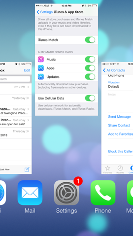
Multitasking has been around on Apple devices since iOS 4 but it was really limited. Developers now have a bit more freedom in iOS 7 and the interface to switch between apps is greatly improved. The new system, similar to the jailbreak tweak Auxo, uses a card-based interface to see which apps are open and lets you get rid of them with a simple swipe up.
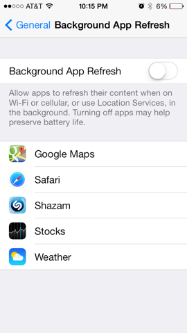
Along the same lines, a new feature called Background App Refresh allows apps to refresh their content or use Location Services in the background. The feature is enabled by default although some (Apple included) say turning it off could improve battery life.
Previous versions of iOS would alert a user when a new update was available for an app with a small badge on the icon. The gesture was nice but it also meant you had to manually update everything. Not anymore.
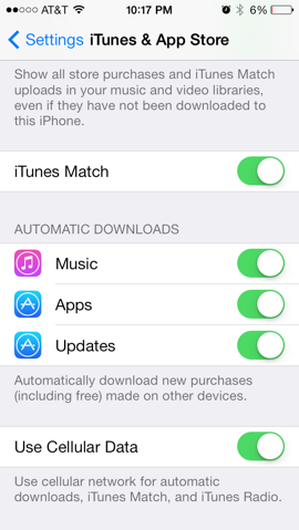
With iOS 7, app updates take place automatically in the background. The setting seems to be disabled by default so if you'd like to turn it on, navigate to Settings > iTunes and App Store and slide the slider for Automatic Downloads: Updates to the "on" position.
The Bad (or Still Missing)
Apple's iPad works in landscape orientation under almost every usage scenario, so why doesn't the iPhone get the same treatment?
I've used both devices and can say it's rather annoying to be restricted to entering a passcode and navigating the home screen on the iPhone in portrait mode only. Sure, it's a minor inconvenience and one can get to where they want to go even when looking at things sideways but it shouldn't have to be that way. It wouldn't take a ton of work on the UI side to allow landscape orientation phone-wide even with the iPhone's limited real estate.
One can't help but notice that Apple still doesn't allow users to select a third-party app as a default app. Don't like Safari? Tough, you're stuck with it as you can't replace it with Chrome as your default browsing app. Not a fan of Mail? You're out of luck again as you can't set another program like Mailbox as your default client.
From a marketing and strategy standpoint, it makes sense - Apple wants you to use their apps, not someone else's. But from a user's perspective, the freedom to use Chrome as default over Safari or Google Maps over Apple's own app shouldn't be out of reach.
I've had the same e-mail address for several years and as such, I tend to receive a lot of messages each day. It's not uncommon to get 100+ e-mails a day after spam filtering which is why it's so annoying to check my e-mail on an iOS device. Why? Because there is no easy way to delete multiple messages.
It's beyond me how such a basic function has eluded iOS for so long. If you want to delete multiple e-mail messages, you have tap Edit then methodically select each and every message for deletion. A "Select All" feature would be extremely easy to implement and save people like me a lot of time and frustration.
While it's true that the keyboard in iOS 7 has undergone some under-the-hood improvements and even a visual makeover (but __why__ remove the .com button?), users still don't have the ability to use true third-party keyboards. Android users have enjoyed access to popular third-party boards like SwiftKey for some time and we think it's about time that Tim Cook and company open up the platform to allow for third-party keyboards.
Earlier this year at the D11 conference, Cook promised to open the platform up a bit more but "not to the degree that we put the customer at risk of having a bad experience." That's understandable as there would no doubt be some third-party keyboard apps that would offer a bad experience but the potential for some really great keyboards far outweighs the negatives in my opinion.
Or rather, any control at all. Look, I get it. Just as with the custom keyboard argument, Apple doesn't want to run the risk of having people turn their home screen into a gaudy MySpace profile. But a little more flexibility in the home screen widget department would go a long way in making the overall experience seem a bit more custom-fit for each user.
I suspect Apple will loosen the reins a bit more over time but Android-like home screen customization likely isn't in the cards.
The inability to remove pre-loaded Apple software continues in iOS 7. In the event you don't use apps like Newsstand or Passbook, you're stuck with them as there is no way to delete them. We've seen this on other phones and operating system and it'll likely continue but truth be told, it's annoying. Apple should let users uninstall these apps. If you need them again, simply grab them from the App Store.
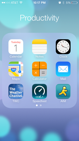
Until that day comes, you're stuck with burying these unused apps in a folder and forgetting they ever existed.
